Ask questionsImprove readability
The calendar, especially in month view, displays an awful lot of information. Therefore it is crucial that the information can be read clearly.
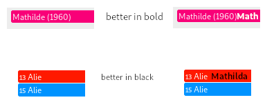
Currently, I can only tune the colours for the events. Depending on the colour, the event text is shown in black or white. This decision is not always optimal, personally I would like some blacks to be white and vice versa. This may, however, be related to the choice of the font used to display the event texts. I seem to have no control over that either.
So to be able to improve the readability, I would like to propose a way to select the fonts used, and a checkbox to toggle black/white rendering.
Answer
questions
AlexandreBonneau
Well, the problem is in my opinion moot, since as @georgehrke mentioned, NC already implement the w3c recommendation that: "Ensure that foreground and background color combinations provide sufficient contrast when viewed by someone having color deficits or when viewed on a black and white screen", as other calendars do.
Related questions